Aced-IT
Interview preparation built exclusively for the design community
I'm James
AI Product Designer
Interview preparation built exclusively for the design community
2026
Weekend dashboard for Mythos vulnerability intel — then a living executive product shaped by weekly leadership feedback
2026
A card-based online banking experience shaped by discovery, in-branch research, and what customers actually want when they open the app
2023
Online account opening, business banking, and a £35M Capability & Innovation Fund win
2018
Building a design function and shipping enterprise products in one year
2020
European city breaks app for curated destinations and frequent travellers
2022
Brand, website, and secure booking platform for occupational health
2025
I am an AI product designer with 26 years of experience, working in print, digital, and now AI. I merge all three skill sets to cope with the rapid pace 2026 has brought upon us.
You get to work with one of the best designers in the business. You want to know my process and all that bollocks? Well, here it is: always start with the problem. Why are you delivering this work? What value does it bring to the business and the User. Ask questions, as we always have done. Speak to users, build relationships with the people building it, and you'll go far with your product. It's not magic or complicated. Communication is the key skill for successful product delivery.
I've done it all from running my own companies, to building startups for others 0 to 1. Been a freelancer for 15 years working in studios and banks producing some great work and working with many wonderful people. I now work as an IC at J.P. Morgan, embedded as an internal consultant on product design for the senior leadership team working between design, AI and research.
Today, I sit in the Claude Code forum at the bank as the only designer who has a license for it, running experiments daily to bring efficiencies to the design process through the use of AI and how AI can help us as designers.
Aced-It is a dedicated interview-preparation platform built exclusively for the design community. In a tech landscape where most interview tools cater heavily to engineering workflows, designers are frequently left behind. Aced-It bridges this gap by offering tailored, interactive preparation that addresses the unique realities of design hiring—from behavioral walk-throughs to the dreaded whiteboard challenge.
Live at acedit.app.
In the wake of post-pandemic mass layoffs, the design job market has become exceptionally competitive. Job seekers face fragmented application processes, opaque expectations, and little to no tailored practice resources.
Drawing from years of senior-level hiring and interview experience, the core objective of Aced-It is to give designers a centralized space to gather their materials, sharpen their presentation skills, master interview workflows, and walk into high-stakes interviews fully prepared.
Aced-It is engineered to simulate real-world design evaluation phases:
Tailored Practice: Users can upload their CV and target job descriptions to generate customized interview practice loops.
Voice-Powered Simulation: Candidates practice by actually speaking aloud, receiving automated grading and constructive feedback to rapidly iterate and improve.
Whiteboard Challenge Prep: To conquer the hardest part of the design loop, the platform features 5 distinct whiteboard challenges. Users can ask clarifying questions to set context—and these diagnostic questions are evaluated alongside their final output.
The product concept was rigorously vetted and iterated through early-stage concept testing with designer peers, combined with structured user-testing sessions to refine the interactive flows and grading utility.
To move rapidly from concept to a production-ready application, Aced-It was built using a modern, efficient stack:
Design & Prototyping: Figma
Development Environment: Cursor
Version Control & Deployment: GitHub & Cloudflare
Database & Backend: Supabase
Payments & Subscriptions: Stripe
I loved this project. It was very much pitch to the client over a few meetings and they left us to get on with it. A fully Android and iOS experience designed and delivered in two months.
I worked with Expedia to understand what customers wanted and tie it back to the campaign promoting European city destinations. Through research with frequent travellers (usually post uni, not settled down yet, going all over Europe), I found they get fatigued looking up places, checking who flies when. It’s a chore.
The concept: give them the destinations, the dates, rated accommodation, sorted. A win for the company selling more destinations, and a win for the customer who can quickly spot a city break they want to take.
The journey starts by setting intent: a city break, built around how this cohort actually travels.
We curated the top city break destinations in Europe and beyond. No endless browsing, just a focused list of places worth going.
Each city opens with a hero view, context on what makes it worth the trip, and a clear call to start building the break.
A short form captures origin, dates, and budget. Just enough to surface relevant flight options without overwhelming the user.
Flights ranked by price and fit, pulled from Expedia’s API. The user picks an outbound option and moves on.
Once outbound and return are chosen, a clear confirmation modal locks in the itinerary before moving on to hotels.
Before showing hotels, we capture what matters: star rating, location, and the basics that shape the shortlist.
Rated accommodation surfaced to match the trip. Clear pricing, clear trade-offs, easy to compare.
Drill into the hotel for facilities, room type, upgrades, and add-ons. The total updates as options change.
A full summary before payment: flights, hotel, dates, and price in one place so nothing is a surprise.
Confirmation with next steps: city guide download, wallet pass, and a path back to discover the next break.
The home screen surfaces recommended breaks and upcoming trips, designed to bring people back when they are ready for the next one.
Preferences and account details, kept native to each platform so the app feels familiar on iOS and Android.
The COO walks into a meeting. Mythos is live. The bank has access to frontier AI that finds vulnerabilities at scale. It’s already running. It’s already finding things.
But here’s the problem: nobody can see what it found. There’s no dashboard. No metrics. No way to report it to leadership. People are pulling data into messy Excel sheets and trying to make sense of it.
The COO looks at the team and says: “I need to see this information for Monday.”
That was Friday evening.
I got called in to design it.
This wasn’t about making a nice dashboard. It was about building visibility for something the bank suddenly had access to but couldn’t measure or understand.
Mythos finds vulnerabilities. A lot of them. Fast. But “50 vulnerabilities found in system X” doesn’t tell a CIO anything actionable. It raises questions instead of answering them. What do you do with that number? Who owns it? How bad is it? How long to fix? Is it blocking something else?
The first version had to ship in a weekend. So I kept it simple. Card-based layout. Pull in what the data team could give me. Count it. Show severity. Create something that leadership could actually look at Monday morning.
But simple doesn’t mean empty. Every number on that dashboard had to answer a question somebody would ask.
I designed the initial dashboard in a day. Simple cards. Counts. Severity breakdown. Time series. The kind of thing where a CIO glances at it and can answer: are we ahead of this or behind it?
The data engineering team built what I designed. We shipped it that weekend.
Monday morning the COO presented it to the CIO, who’d actually been asking for years for exactly this kind of interface. From there it got wider. Senior stakeholders wanted access. They wanted different views.
That’s when the real work started.
I started weekly meetings with leadership. Not stakeholder interviews in a conference room. Real weekly calls with the COO, the CIO, senior security leadership. Their calendars are insane, so weekly was the only way to get consistent feedback.
Every call went the same way: “You know what would be really great to see here?” Then we’d talk through it.
Is this metric at the top because it’s important or because it’s easy to calculate? Should this be a static number or a frequency? Can we combine these into a graph? What decisions does this number actually enable?
Each conversation shifted what I was building. Not radical rewrites. Targeted iterations. What information should sit where? What’s the hierarchy of attention?
I’d design it in Figma that week. Create a block UI (basically a wireframe where I label every component from the design system). Share it with the data team to make sure we could actually calculate it. Then use Claude Code to build the prototype.
A few weeks in, a question came up in a meeting: “When I see a vulnerability, I want more context. What’s wrong with it? Who owns that system? How long has it been a problem? What’s downstream of it?”
The answer was obvious. You can’t cram all that into a card. But you can give users a way to ask.
I designed an AI chat drawer that opens on any vulnerability row. Users can ask permission-aware questions. The AI answers based on what they’re allowed to see. It’s not showing secrets; it’s filtering by role.
If a junior engineer asks “what vulnerabilities does the trading system have?” the AI doesn’t refuse. It says: “You can’t view that, but here’s what you can see about your assigned systems.” Then it shows them what they actually have access to.
More important than answering questions: I added pre-made action buttons. Users can email the owner directly. The AI drafts the message. I even added positive ones, like “great news, John’s team fixed 40 problems” so people can send congratulations.
That feature got loved immediately. Users didn’t need to escalate to get answers. They didn’t need to wait for someone to explain what a vulnerability meant. They got context and took action in the same tool.
Here’s where the timeline actually compresses.
When leadership says “wouldn’t it be great if we could do X?” on a Thursday call, I can ship it by Tuesday.
I design the drawer in Figma with the copy and the interaction. I create a block UI showing which components go where. I give Claude Code the design plus the block layout and tell it: use this component from our design system, build it to look like this, and handle this interaction.
It gives me a prototype. Usually pretty close. Then I iterate. Three or four rounds typically. The iterations aren’t about design. They’re about the details. What should these quick buttons say exactly? What’s the right copy for loading states? What should this animation feel like?
Because I’m using Claude Code, I can have those conversations at speed. I can iterate on copy or interaction without waiting for engineering. By the time leadership sees it, it’s actually polished.
That’s the only reason “Thursday request becomes Tuesday shipped” is real.
Everything on this dashboard is classified. Everything is sensitive. So when I designed the AI chat, I had to bake in principle of least privilege from the start.
Not every user can see every vulnerability. Not every user should be able to search for vulnerabilities in every system. The AI doesn’t have the authority to show secrets. It has the authority to show what you’re allowed to see.
It’s careful by design, not careful by accident.
The dashboard shipped. It’s still in use. It’s been in use for months. Every single week we’re iterating on it based on feedback from the people using it to make actual decisions.
The engineering teams are about to start using it differently (they’ll have their own view, focused on fixing rather than reporting). That’s a whole different design problem.
The ideas on the roadmap: automatically fixing vulnerabilities and telling us what was fixed. Scheduled reports. AI-powered monitoring that patches things on its own. Those are all waiting.
But the core system works. Leadership can see what Mythos found. They can understand the scope. They can make decisions in hours instead of days. They can act instead of just report.
This project taught me something that I still apply every single day.
High-stakes work isn’t about being clever. It’s about discipline. Every person using your design is making a real decision that affects real infrastructure. You can’t be sloppy. You can’t guess.
That’s why I approach Claude Code the way I do. It’s powerful. It’s fast. But fast doesn’t mean good when it matters.
You need human gates. You need to understand what the data actually means before you visualize it. You need real user testing, not synthetic scenarios. You need to iterate based on how people actually use it, not how you think they will.
The Claude Code workflow I use now borrows everything I learned from Glasswing. Design in Figma. Create clear structure. Let AI build the prototype. Iterate on what matters. Validate with real users. Then hand off.
Each step filters something different. By the end, the work is solid.
That’s not how most people use AI tools. But it’s how you use it when it matters.
I came back to NatWest as a freelancer on the strength of a previous engagement. The brief was to build a new online banking experience. What that actually meant took a trip to London and a series of discovery sessions to figure out properly.
We sat with people across the business and asked the obvious question first. What does a customer actually want when they open their banking app? They want to know where they stand. How much have I got, what went out recently and can I pay someone quickly. Everything else is noise. That insight shaped everything.
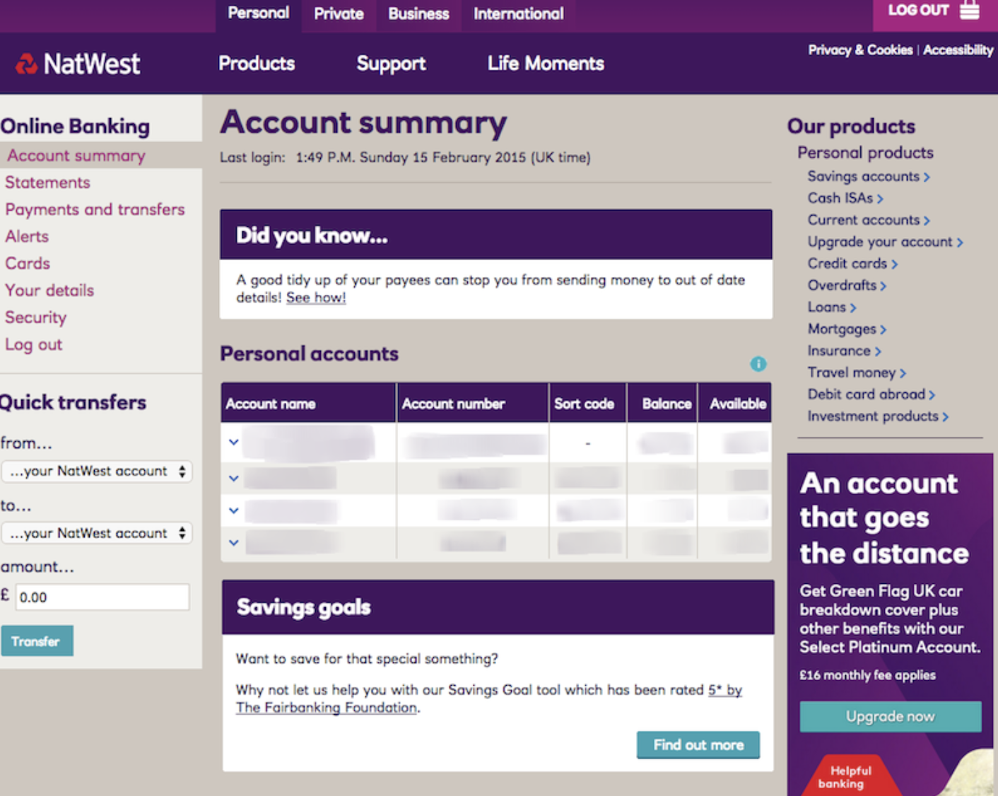
The existing interface pushed promotions at customers the moment they opened the app. My Rewards banners, savings goal prompts, product upsells in the sidebar. Research confirmed what we suspected. Nobody decides on a whim to take out a loan because a banner caught their eye. It frustrated people and buried the thing they came for.
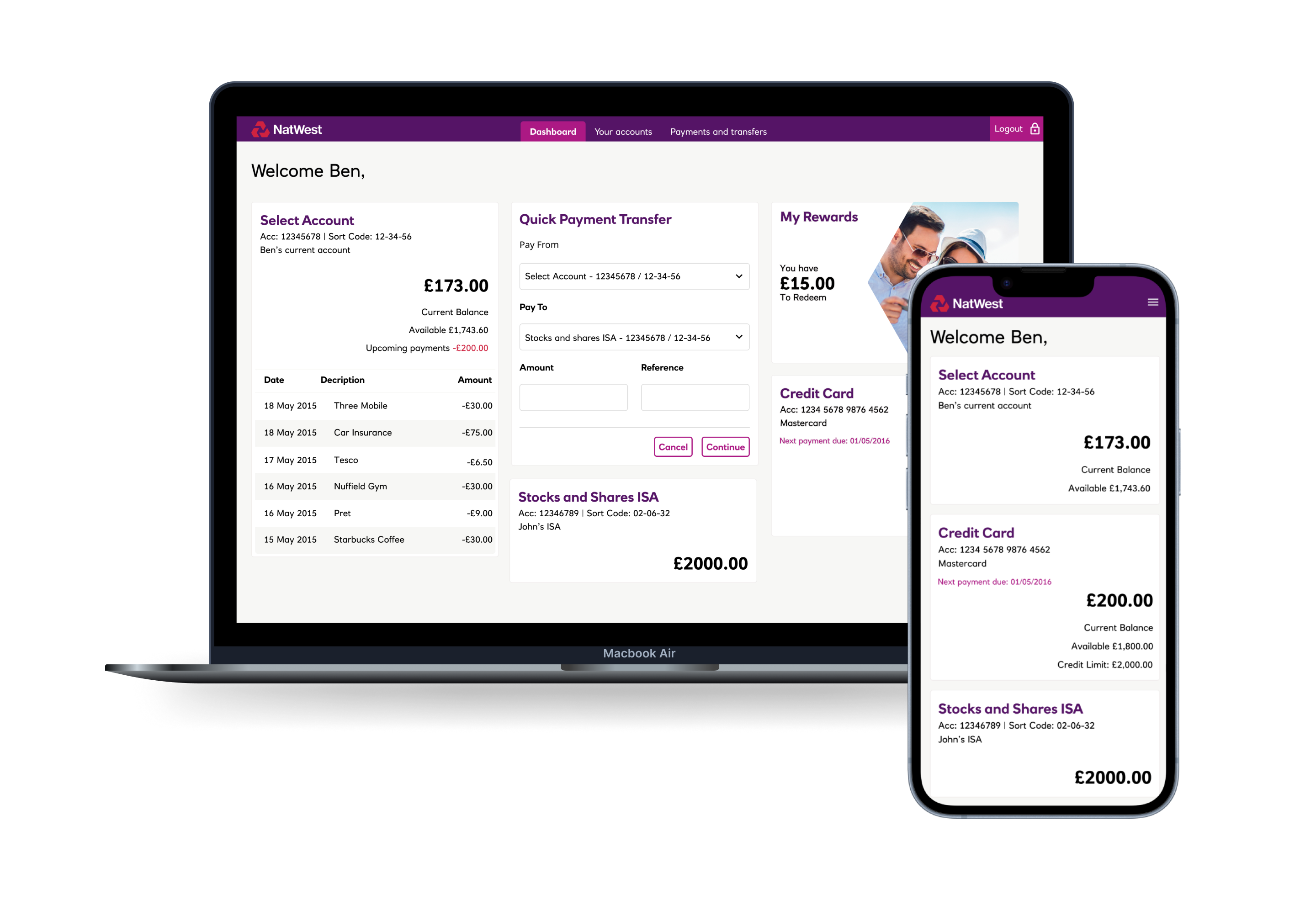
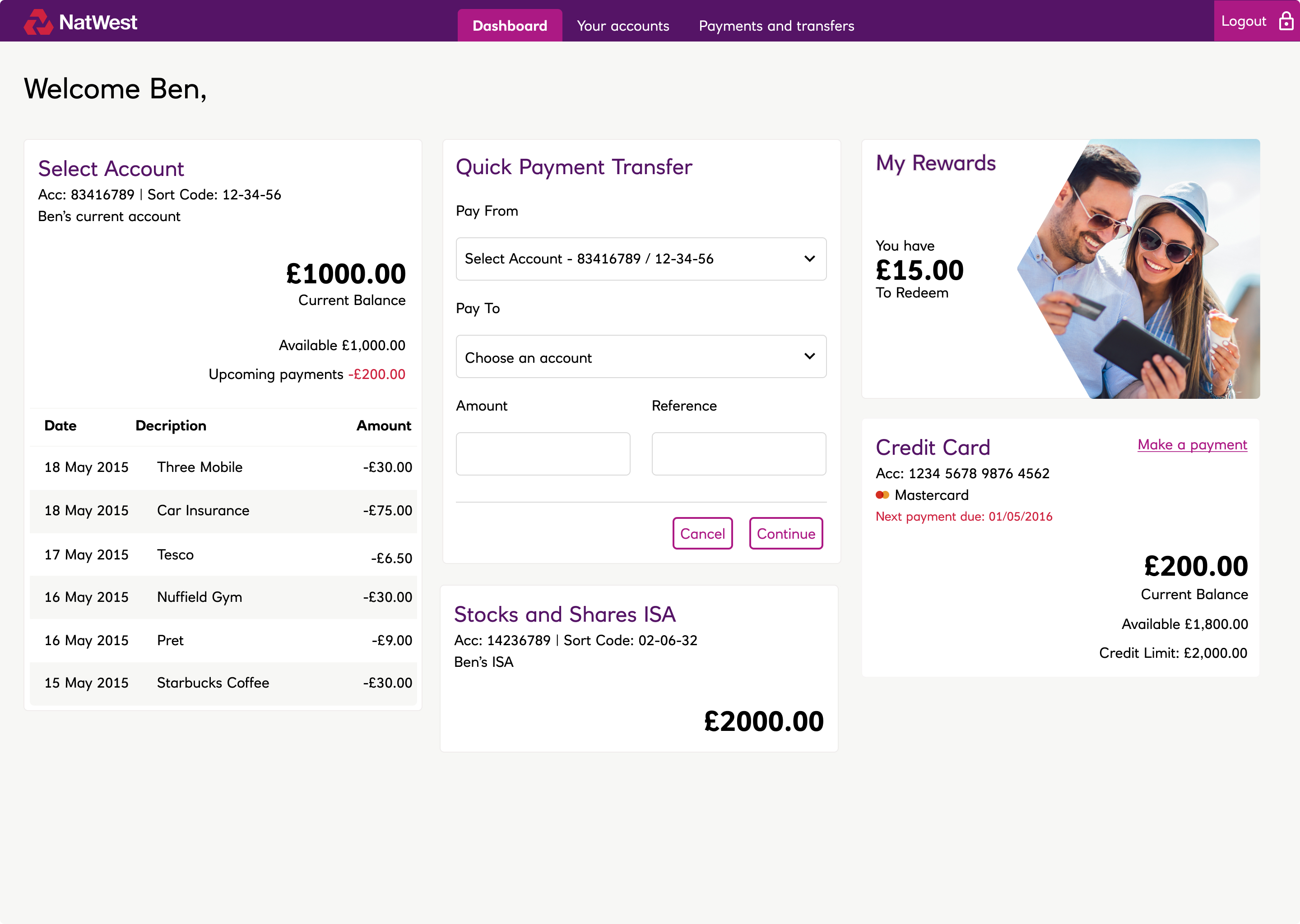
We stripped it back. One card per account. Current, savings, credit card, ISA, whatever you have sits there clearly with its balance and the last few transactions visible without a single extra tap. Cards made sense over a flat list because of orientation. You might have three or four accounts at NatWest. A list gives you everything jumbled together. Cards give you a clear picture of each one at a glance.
The project had turbulence. Leadership changed more than once and the technology shifted with it. Working as a consultant meant I could step back from the politics and keep building. During quieter periods we used the time well.
Alongside customer facing features I was building and maintaining the design system. Sense checking patterns. Is our colour consistent? Does filtering a transaction list use the same logic as filtering anything else? Are spacing and components speaking the same language? We spent more time with customers in stores, tightened the product, and drove consistency before the next push.
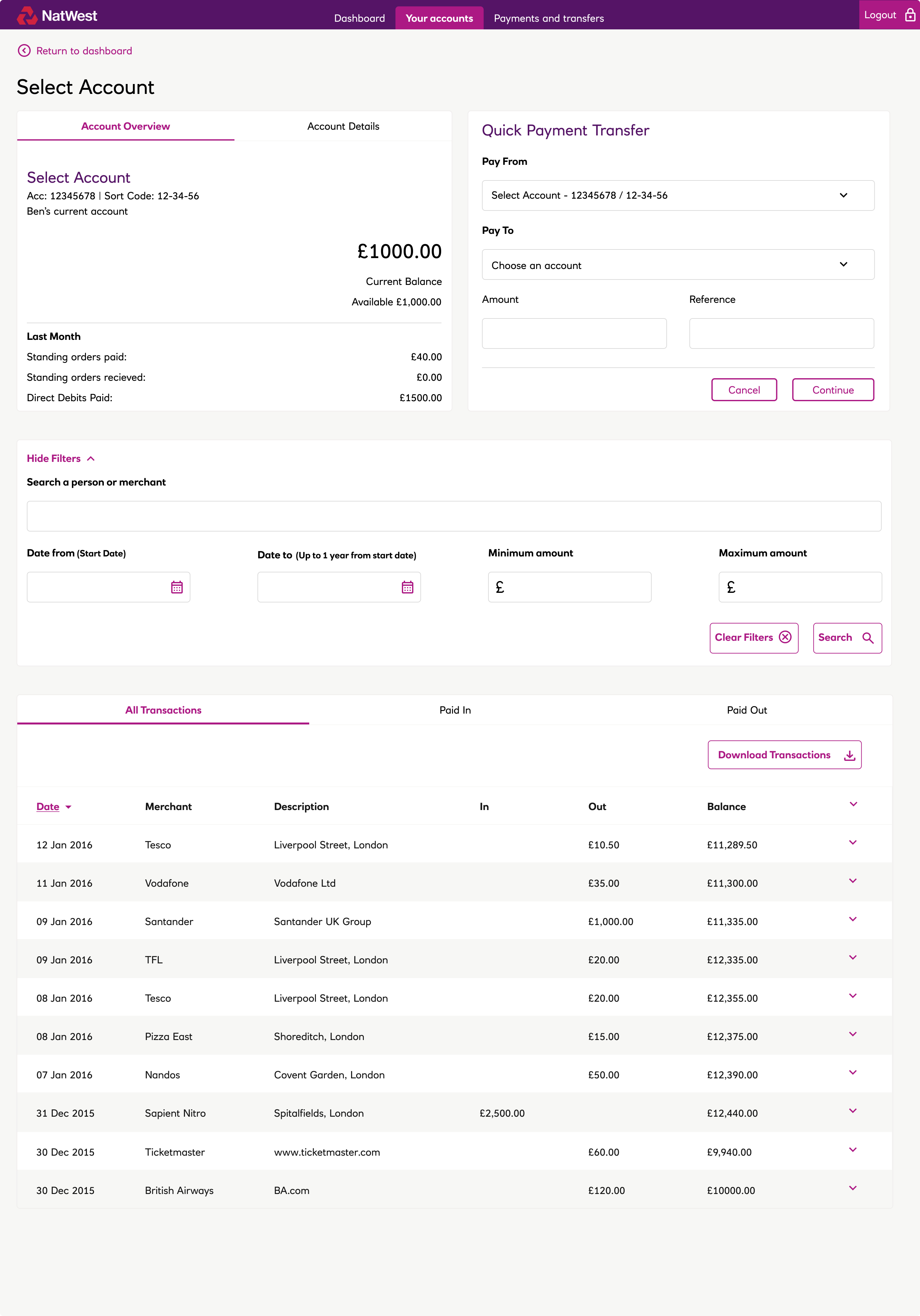
The dashboard puts accounts front and centre. Each card shows its balance and recent activity at a glance. Your rewards account sits alongside your current and savings accounts without getting in the way. Quick payments are always one tap away, not buried three screens deep.
At the time this was new territory for banking apps. A lot of what you see in the market now borrows from this approach.
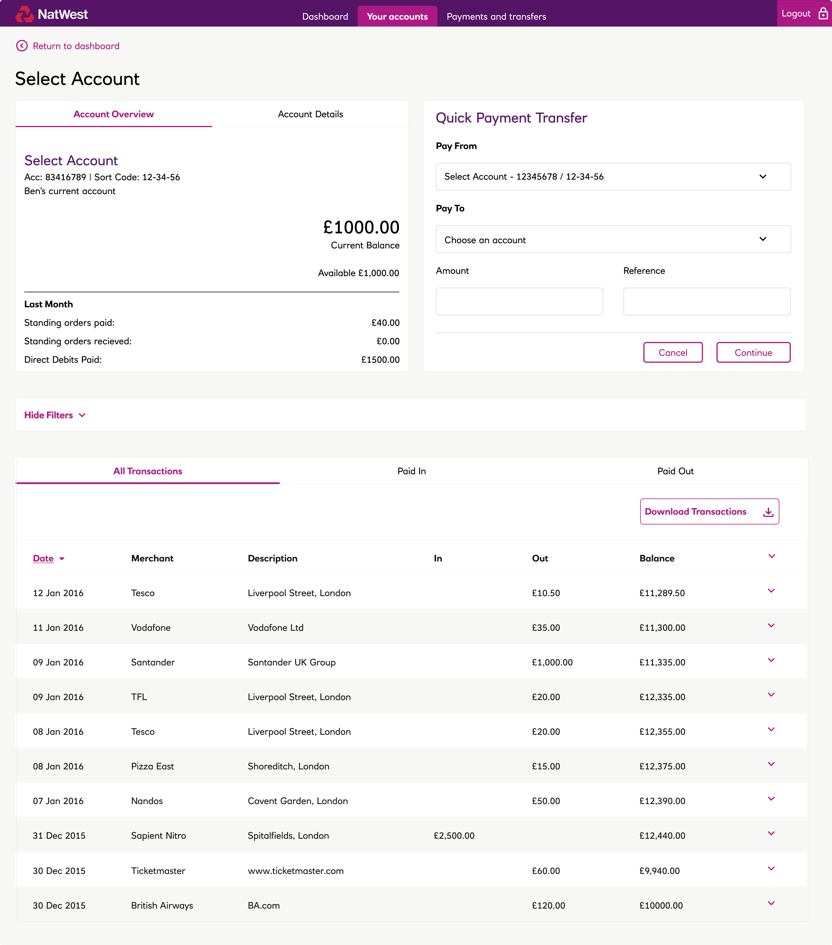
People scan their statement looking for one of two things. Something specific they remember or something they don’t recognise. The design had to support both without getting in the way.
Selecting an account opens a transaction view with the high level detail upfront. A full list of transactions loads on scroll to keep the page fast. You can make a payment directly from here without navigating away.
We ran prototypes out to real customers on iPads in branches. Researchers on the team would sit with people and watch how they used it. We could make changes, retest and validate quickly. It also gave us something concrete when pushing back on product managers. We had been to customers. We had evidence.
Making a payment is one of the most common things people do yet it was more complicated than it needed to be. We gave it its own card on the dashboard so it was always one tap away.
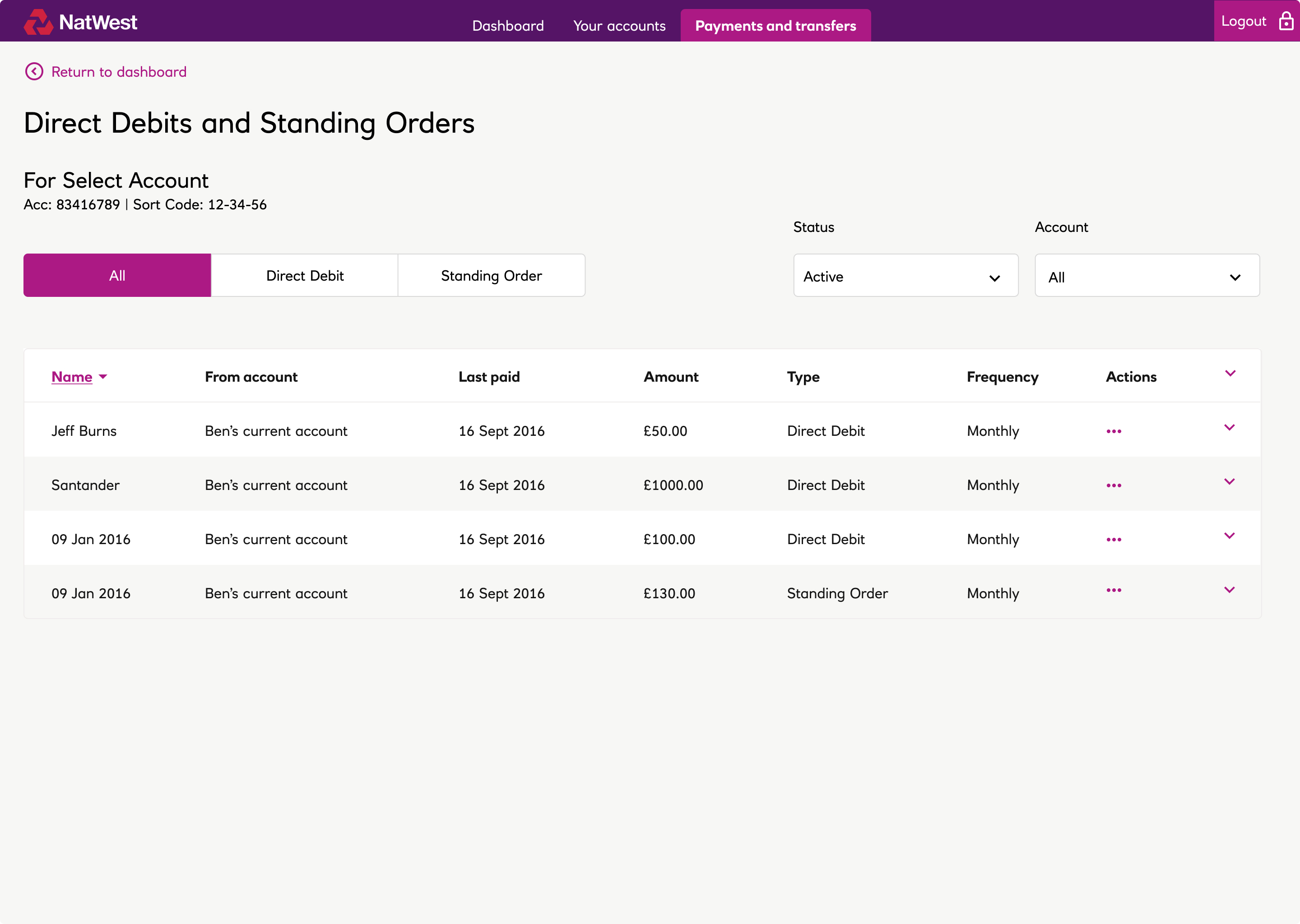
Direct debits and standing orders needed the same clarity. Payees, standing orders, and direct debits are easy to scan at a glance. Expand any row and you get more detail on the transaction, including where it was made.
Behind the simple experience of adding a payee sat real work done with the fraud and compliance teams. When you add someone new the system checks that the account details match the name you have been given. For large payments I worked with the fraud team on a small but meaningful idea. Before sending a significant sum you get the option to send £1 first to confirm the account is correct before the rest follows.
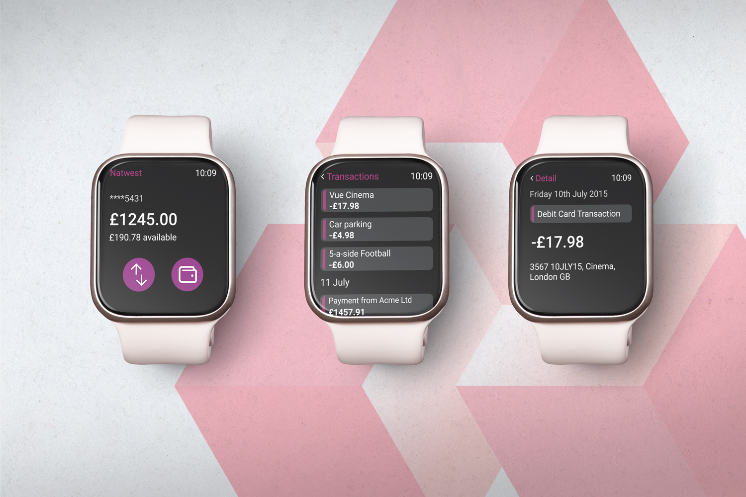
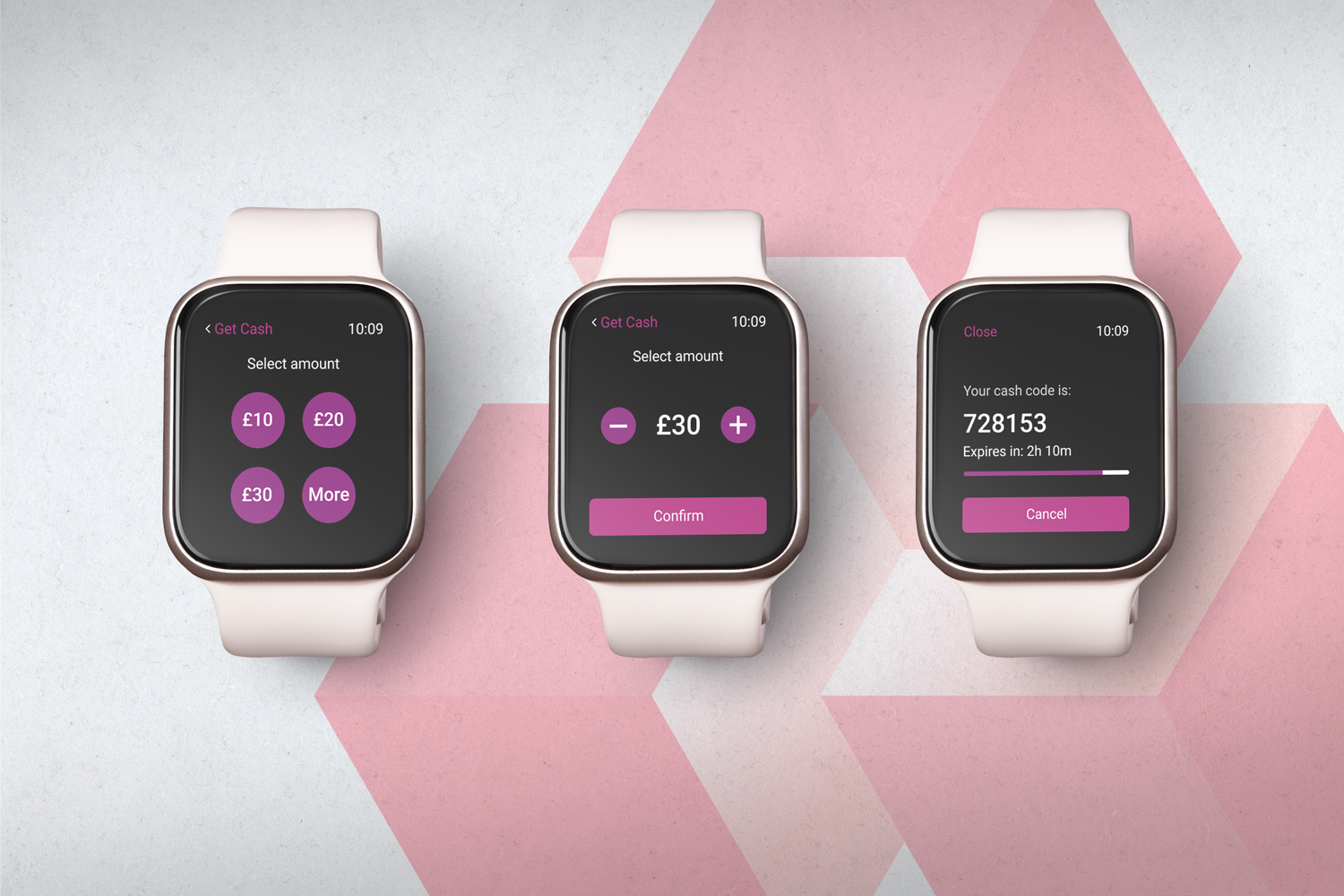
The design system and patterns we established scaled beyond desktop. On Apple Watch, customers could get a code to withdraw cash even if they forgot their card, check their balance, and browse recent transactions. Same thinking, adapted to a completely different context.
Getting anything shipped on a project like this is an achievement. A lot did ship and the thinking behind it has had a longer life than the features themselves.
One of my more recent freelance projects. A friend who is a leading doctor in Occupational Health needed a revamp of a site that was fine 15 years ago but has not kept up with his offering and brand.
What started off as a traditional brand project (building a system from a logo up to a full website) became about identifying what his competitors are not offering. Like the ability to book appointments online, send confidential data from companies’ HR to OHNI and back securely.
It was also an opportunity to automate a lot of processes as it’s a small operation doing big things.
Before redesigning screens, I reworked the sitemap so clients could find services, book appointments, and manage records without fighting the old structure.
This is what we were redesigning. Functional enough for its time, but dated in hierarchy, type, and how it presented the practice.
On the front end there is a shiny new website to go live with. Again, its idea is in the ability to stand out from the competition. Why must medical sites be stuck in the year 2000?
Space to introduce the practice, the people behind it, and why companies trust OHNI with their staff wellbeing.
Services needed to be easy to scan and understand, so HR and employers can match what they need without a call first.
Online booking was a core gap versus competitors. The booking flow lets companies arrange consultations without email tennis.
The new site will go live by the end of 2026. We are still putting the final touches on the back end.
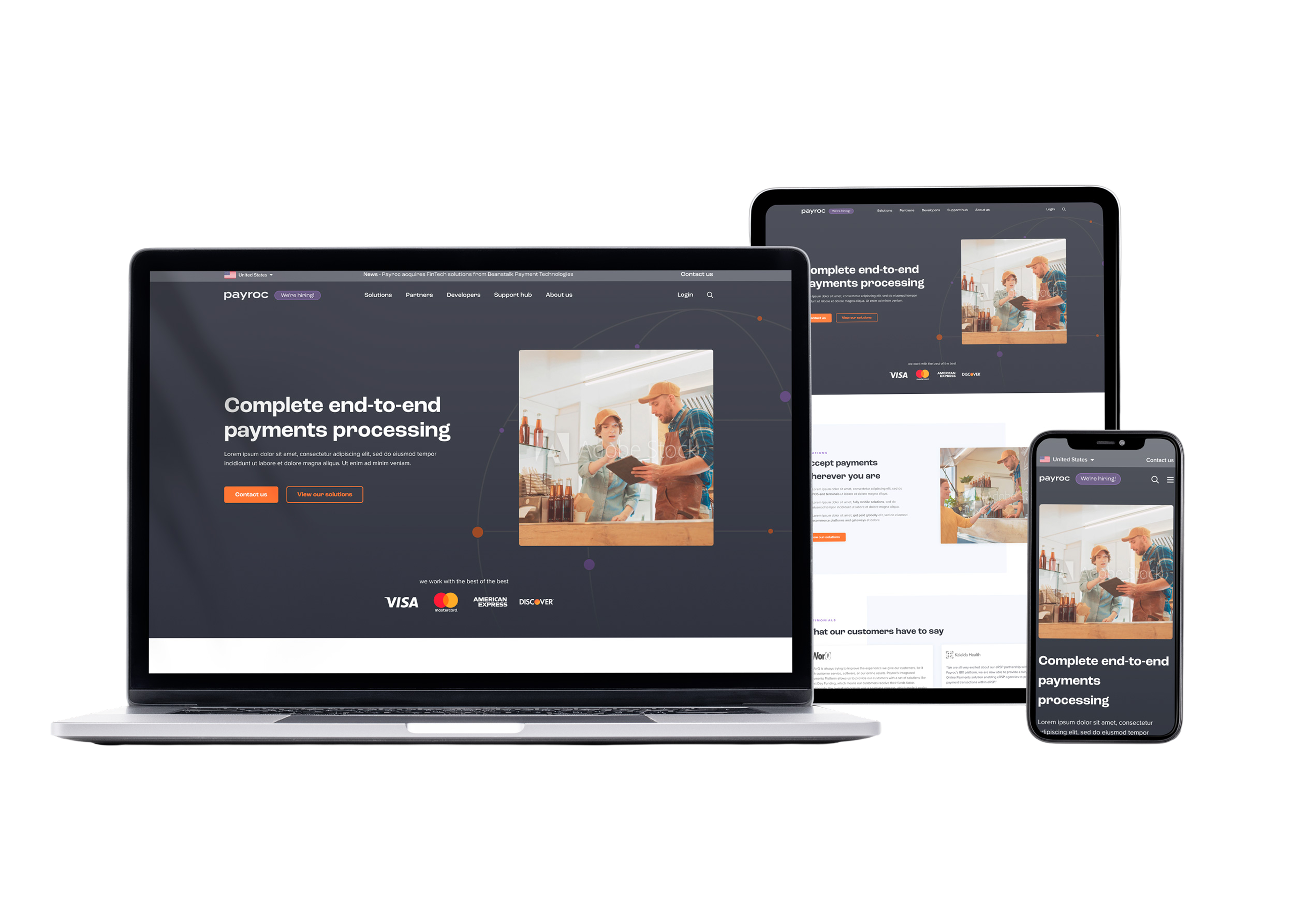
Payroc was a fun time. It was 100% remote and felt like a start up. Multiple merged companies with no design capability and an appetite to grow. Payroc operate in the same space as J.P. Morgan, Stripe and Adyen. Payment processing, and making money off the back of that processing.
I was hired as a design manager when there was just me. Inside a year my team delivered a new enterprise website, a developer documentation portal, a support hub, an internal selling platform, Partner Engage, and a design system to keep it all consistent.
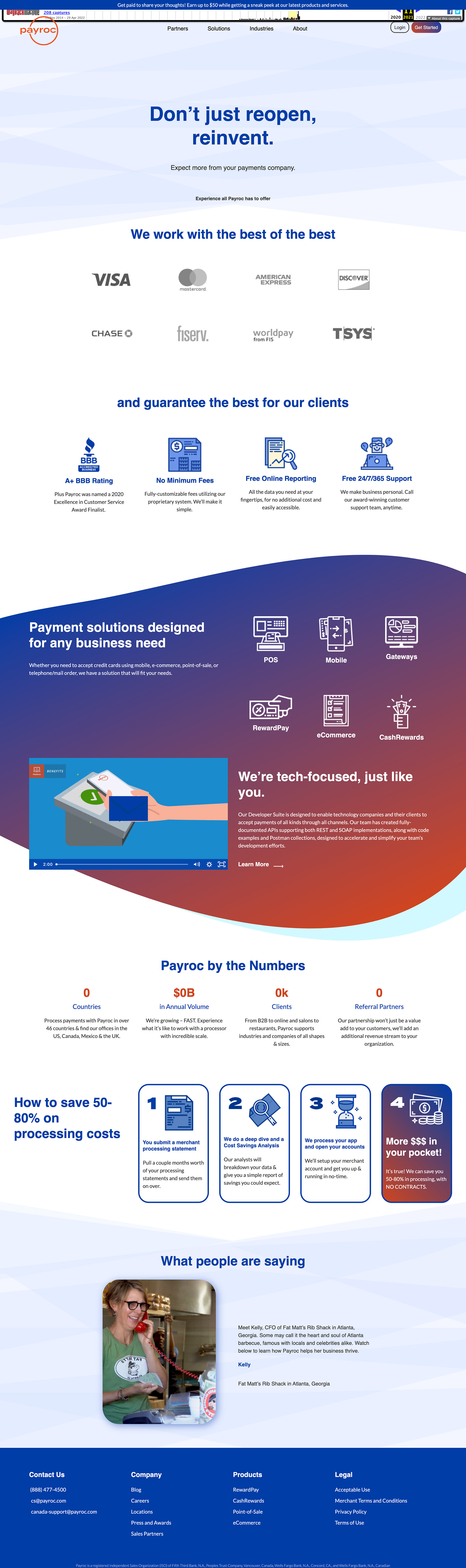
This is where we started. A marketing site that did the job, but felt dated next to the products we were building behind the scenes. It needed a proper enterprise presence to match the scale of the business.
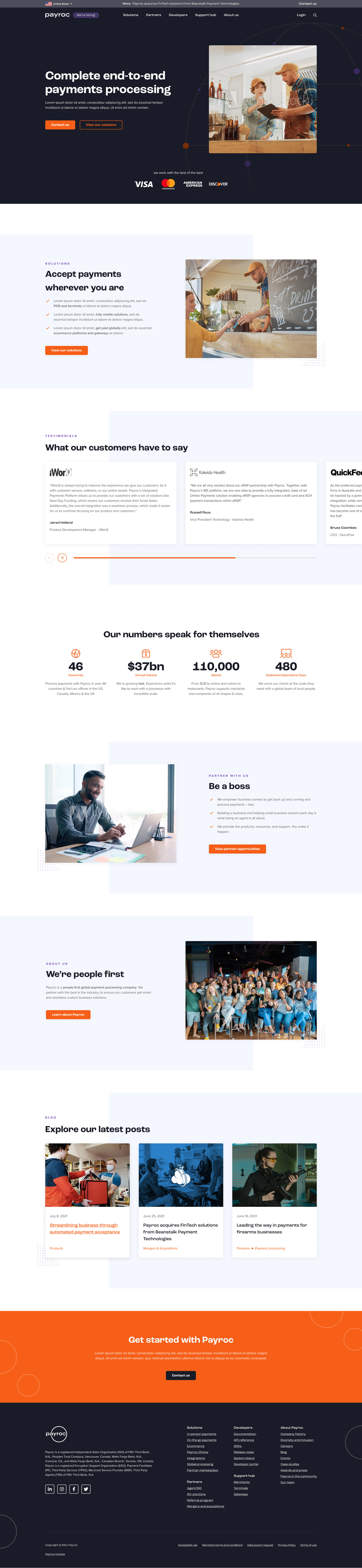
The new site gave Payroc a modern enterprise face. Clearer hierarchy, stronger product storytelling, and a structure that could grow as the portfolio expanded.
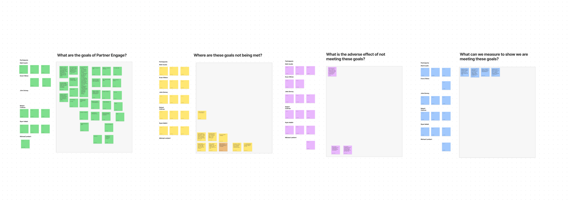
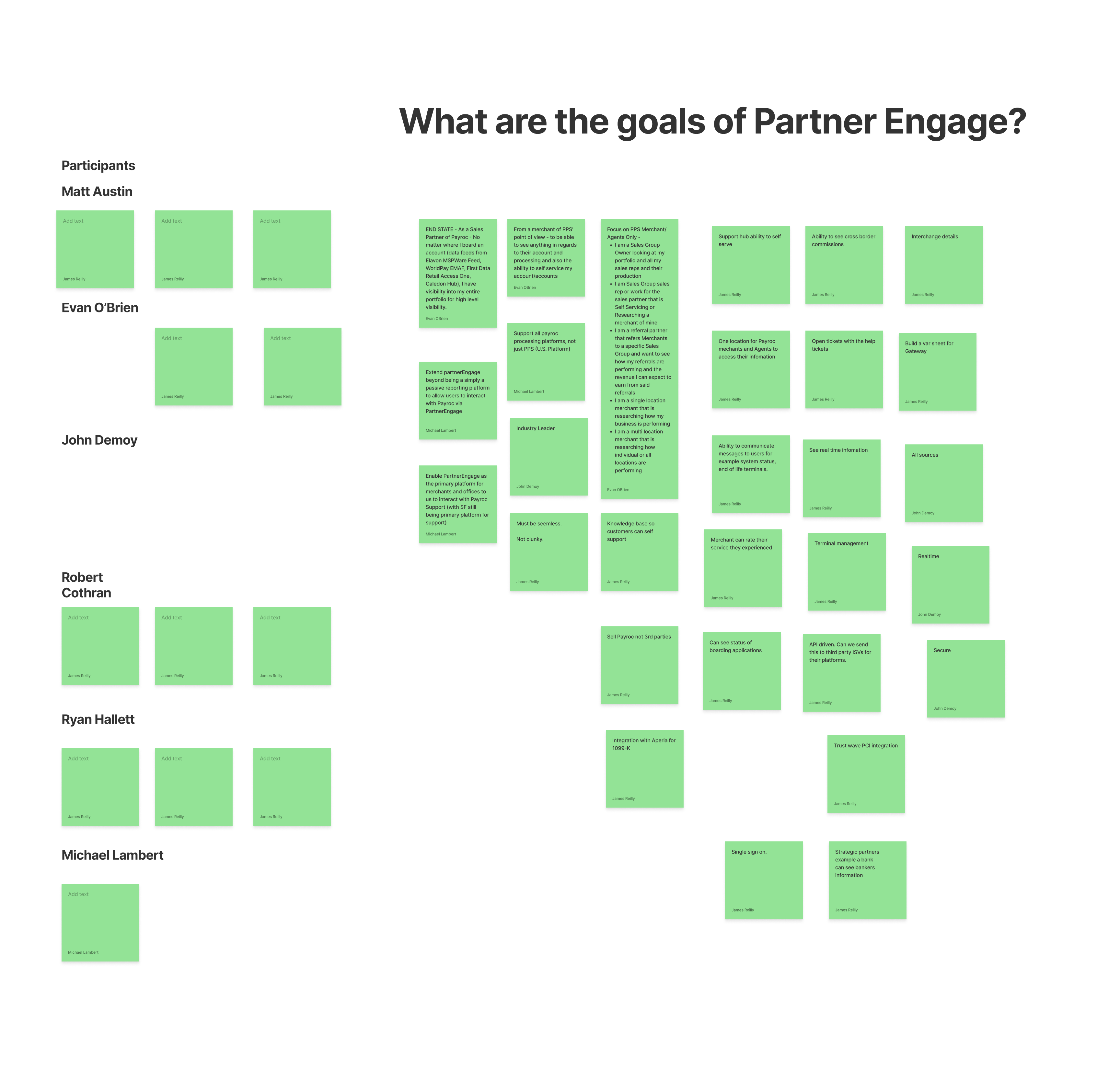
Partner Engage was one of the biggest bets. A platform for partners and merchants to manage portfolios, reporting, and onboarding. We did not jump straight to pixels. We ran discovery workshops with sales, product, and leadership to understand what the platform needed to do and where the old experience was failing people.
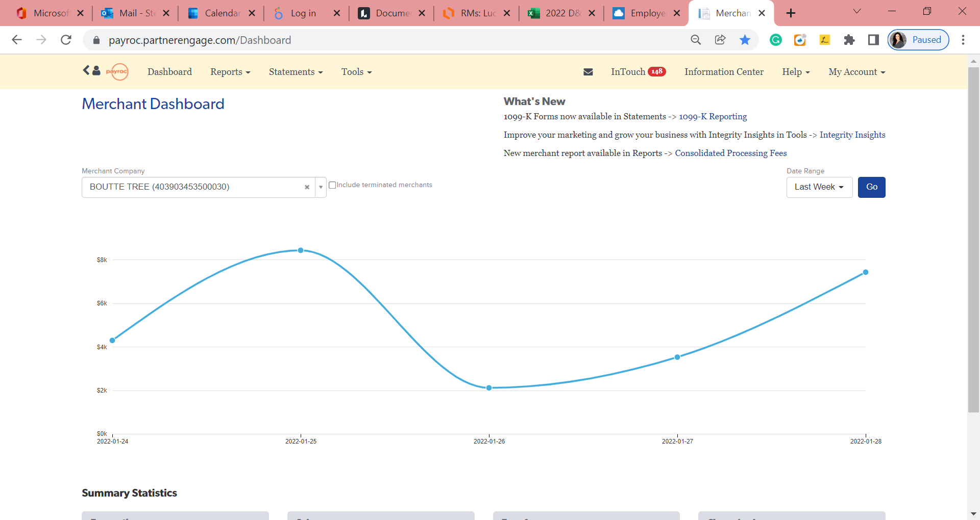
The legacy platform worked, but it felt clunky. Reporting was hard to parse, navigation was dense, and it did not reflect the product Payroc was becoming.
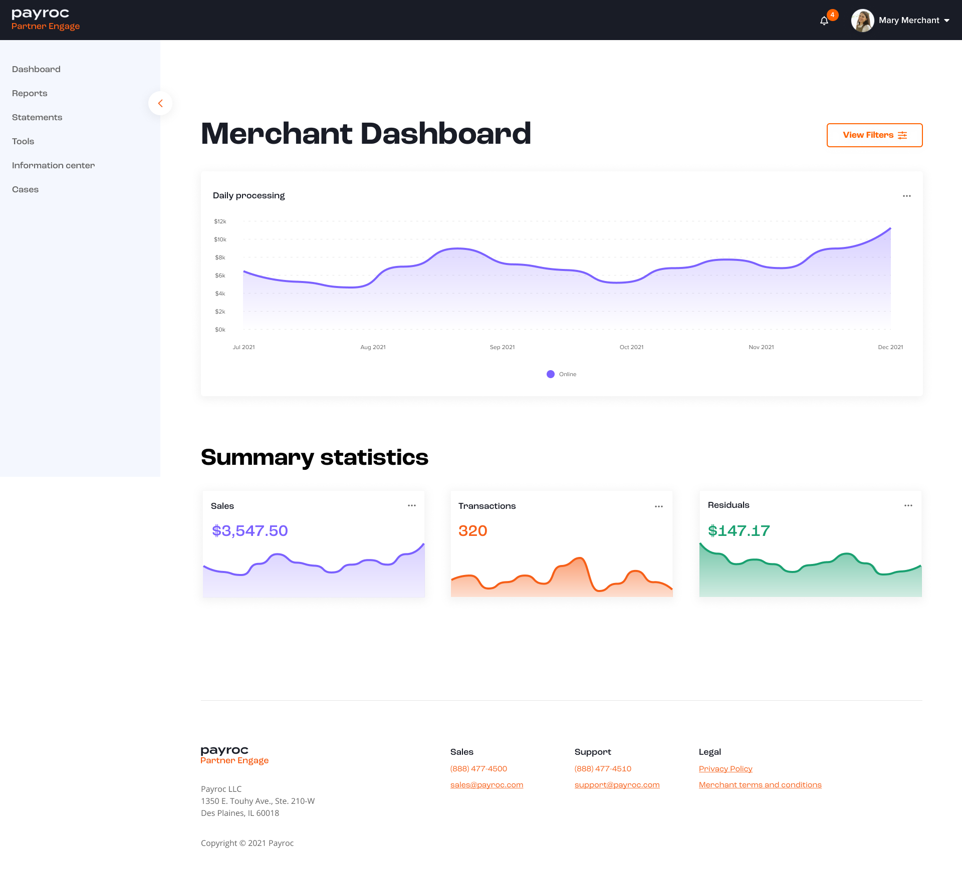
The modern platform brought clarity to the dashboard, simplified navigation, and gave partners a view of their portfolio that actually matched how they work day to day.
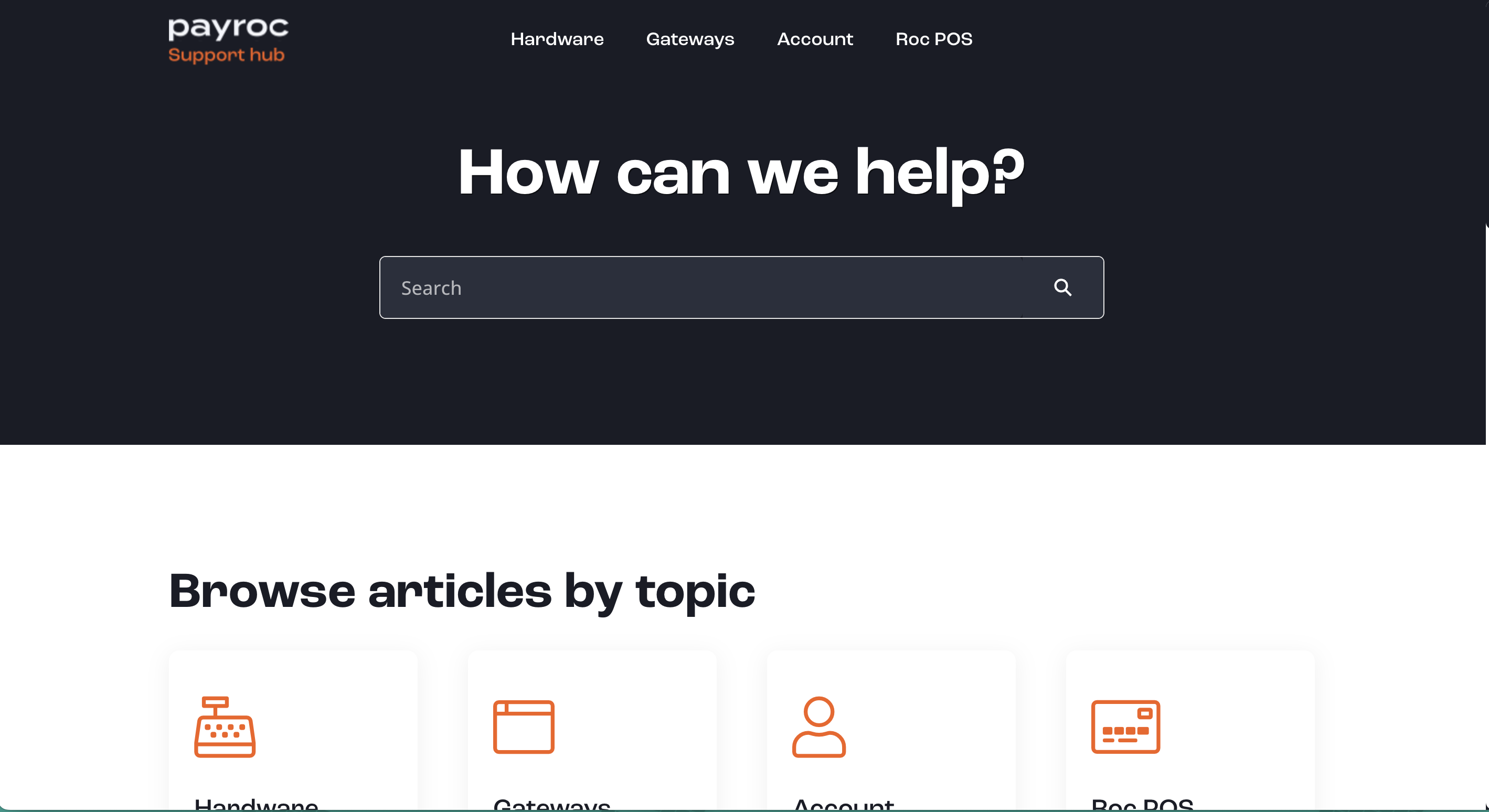
Alongside Partner Engage we shipped a support hub so customers could self-serve, find answers faster, and reduce the load on internal support teams.
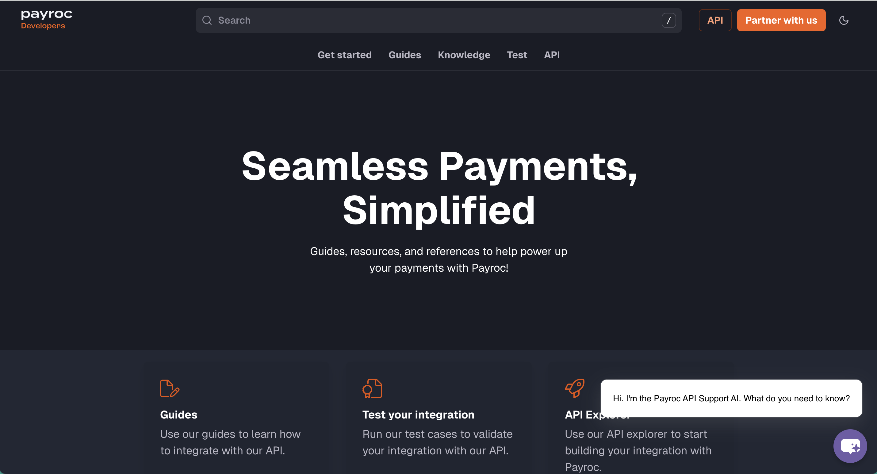
Payroc is tech-focused. The developer portal gave partners and integrators the documentation, APIs, and onboarding they needed without hunting through scattered resources.
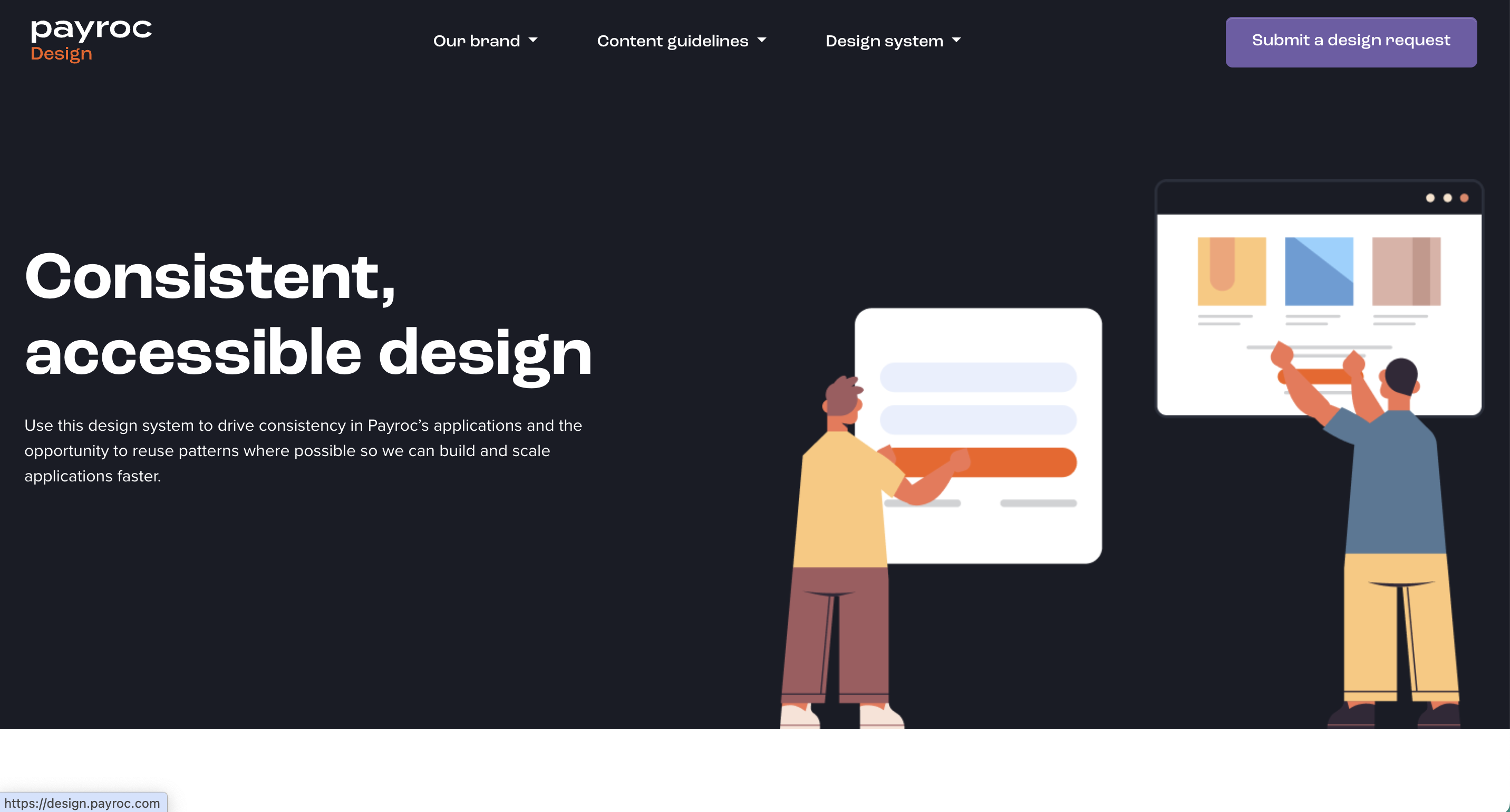
None of this stays consistent without a system behind it. We built a Payroc design system so every product, from marketing to Partner Engage to internal tools, could share components, patterns, and brand logic. That is what made shipping this much product in one year possible.
It would go like this: attend a meeting with leadership, leadership list problems, I step forward with an idea to fix it, go back to the team to scope it, research it and prototype it, then back to the board with the idea, then get engineering to build it.
I guess we got so much done because we worked in small teams and I had direct access to decision makers. It was easy for me to go back: “Me and this decision will reduce customer calls by 60 percent.” Always give detailed numbers to leadership. No one cares about the craft at that level. Harsh but true.
The work you see here is my direction but carried out by some incredibly talented designers. That was the reason I left. I was not on the tools as much. I left for an individual contributor role rather than a design leadership role.
I achieved a lot in my time consulting with Virgin, originally Clydesdale Bank. When I joined the bank didn’t even have a way to apply online.
My first project was creating an experience that could be replicated for the suite of products: Current Accounts, Savings, Credit Cards, ISAs. Weeks sitting with architects going back and forth between tech decisions and UX decisions, trying to reach a compromise on what was right for the user but secure for the bank.
After delivering account opening, I got asked to look at business banking. Virgin Money acquired the bank and everything changed. Business banking was a sleeping giant. Data showed on average it took six weeks plus for a potential customer to go through a business account opening process. Once approved, the app was not mobile optimised. You couldn’t make payments without going to a branch. You couldn’t add staff to manage day to day finances.
Me and another designer, Michael Mearns, worked tirelessly with stakeholders to fix these issues. We won a portion of the Capability and Innovation Fund. £35 million.
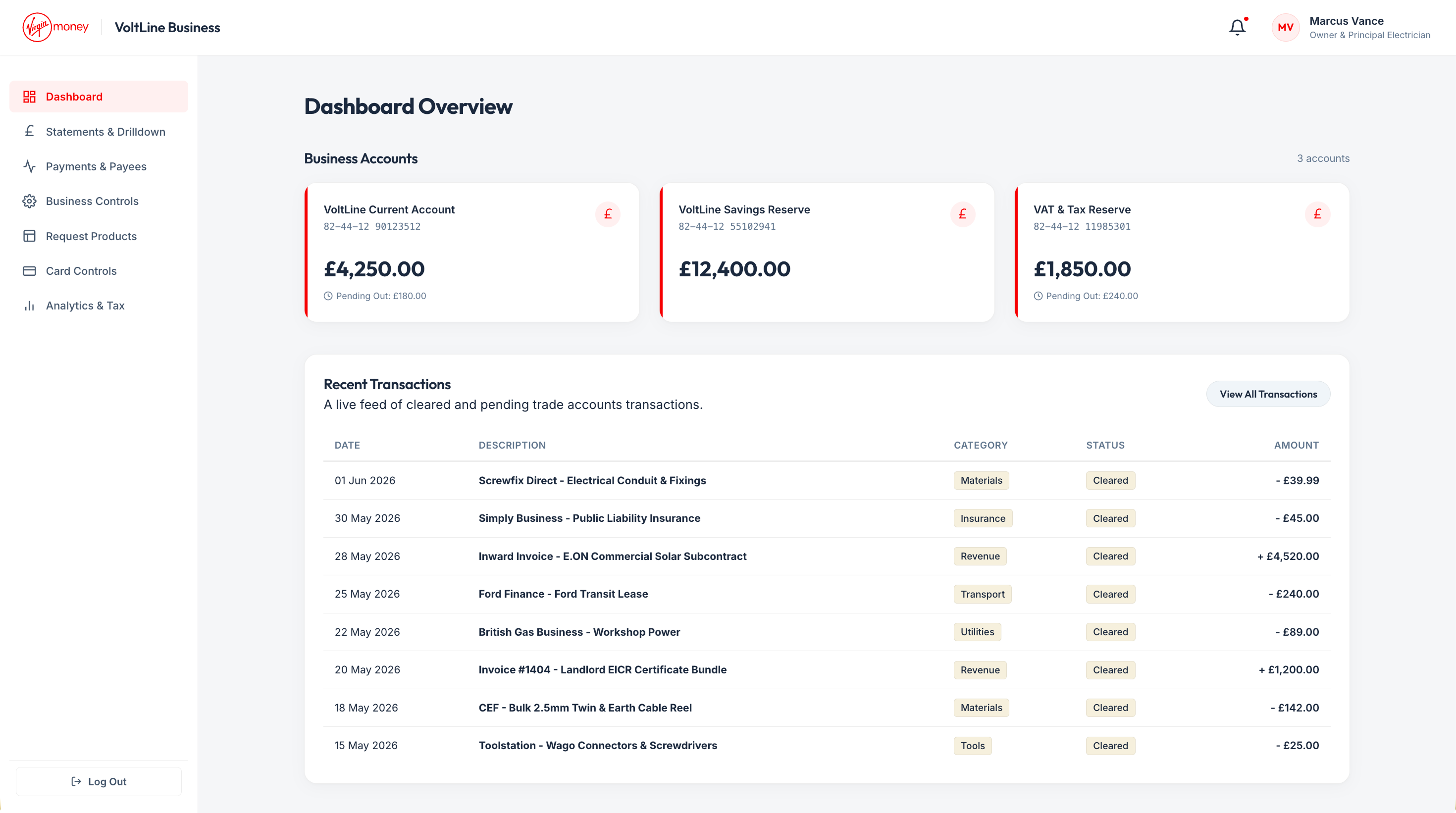
The dashboard addresses the information architecture and surfaces the key details for each account, what a business owner needs to see the moment they log in.
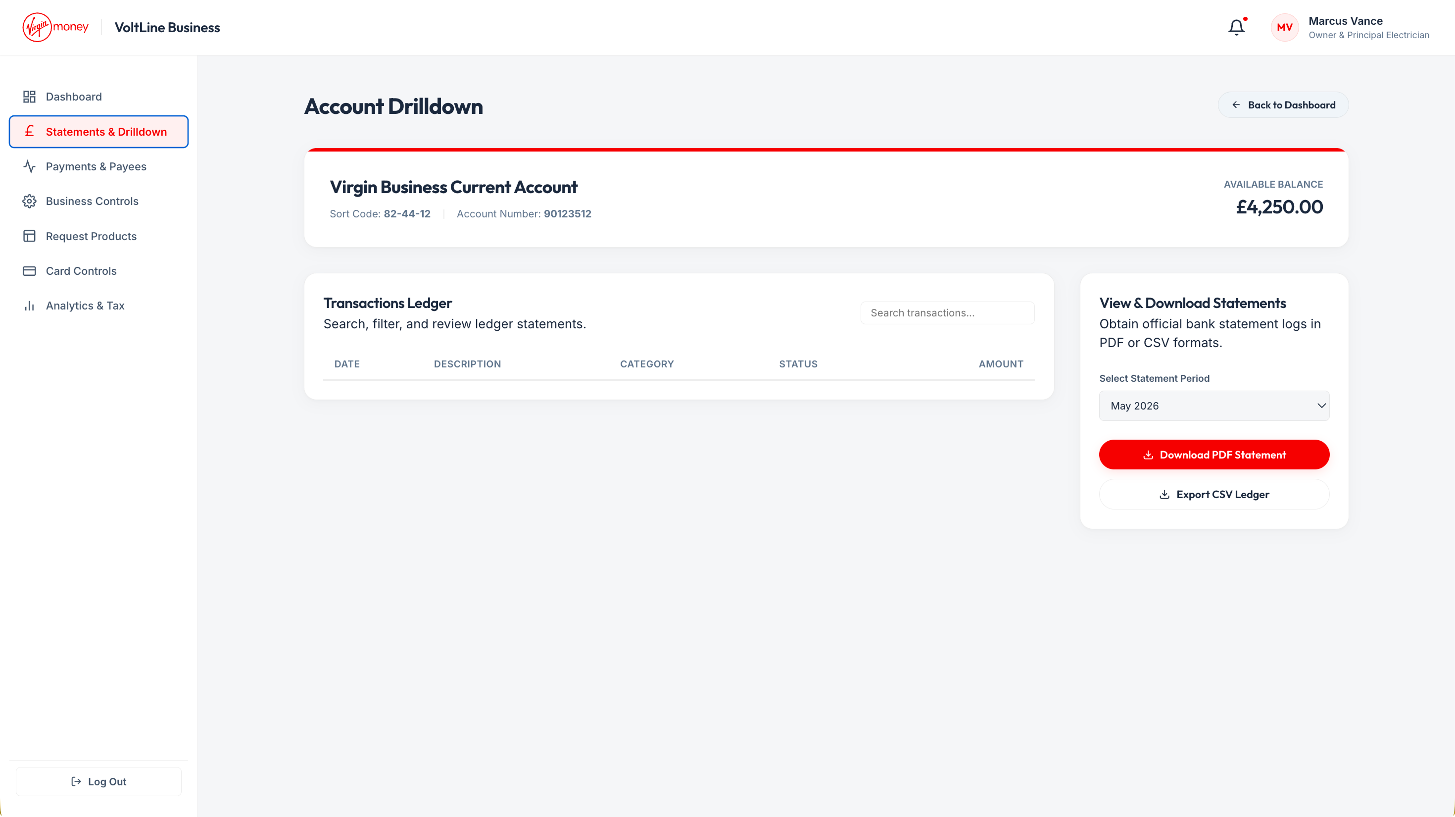
Drilling into the current account gives a full view of activity: balances, recent transactions, and the detail needed to understand where the business stands.
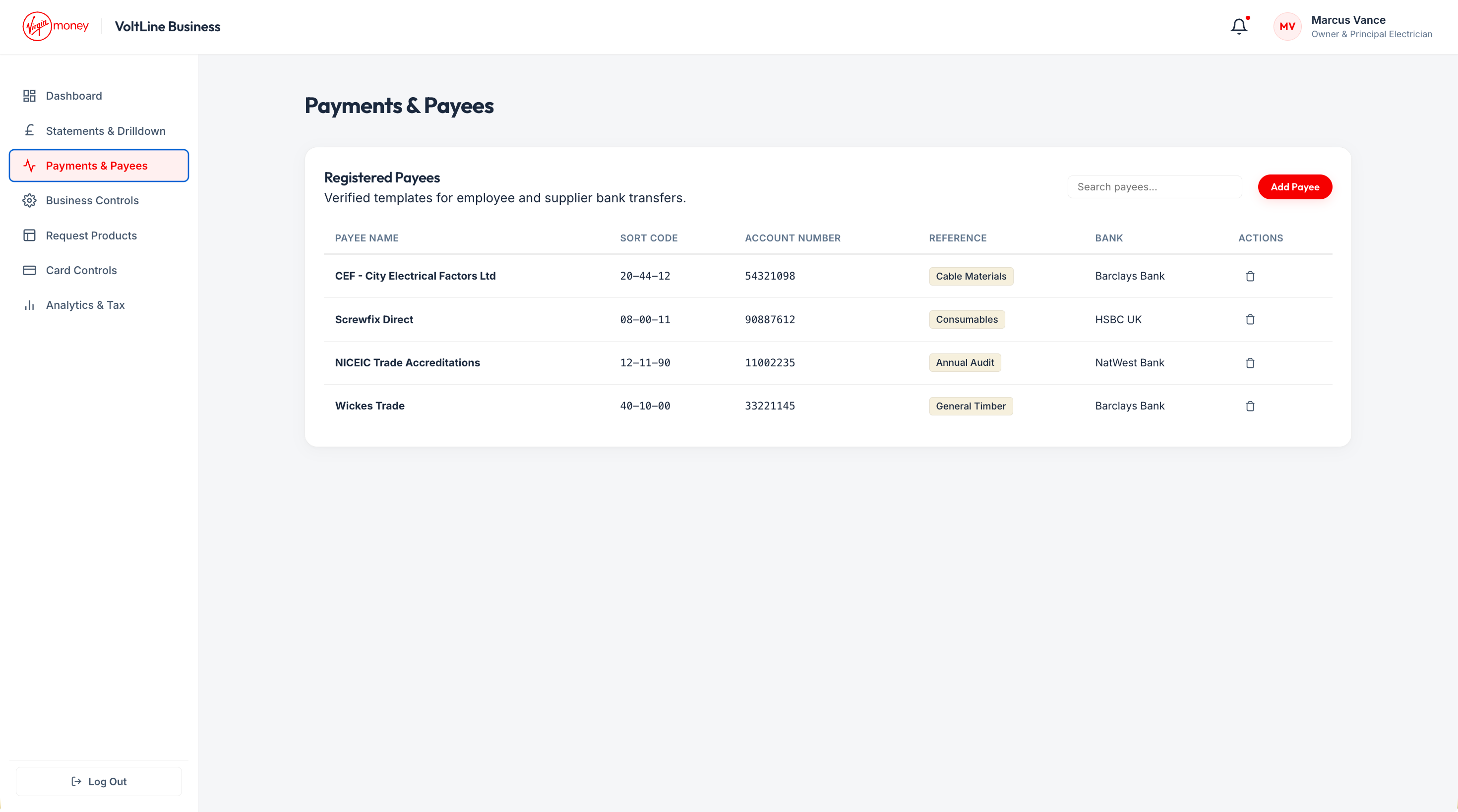
Making and managing payments is central to how businesses operate day to day. Payees are easy to find, review, and pay from one place.
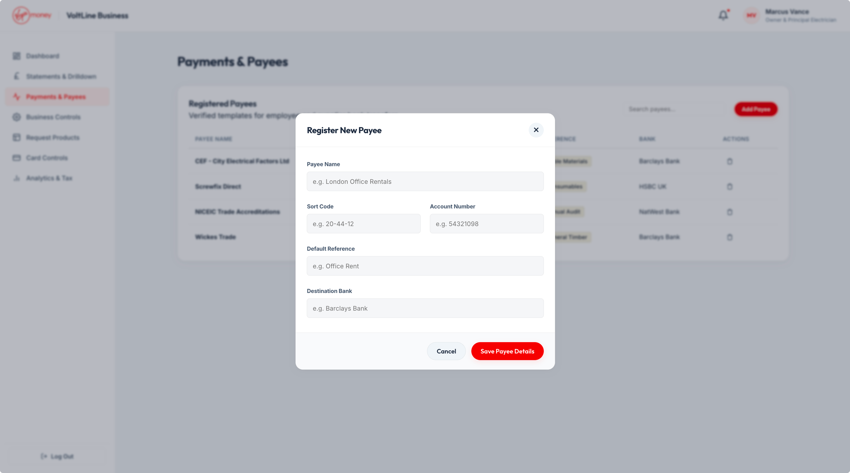
Adding someone new had to be straightforward without cutting corners on security. A clear flow from search to confirmation.
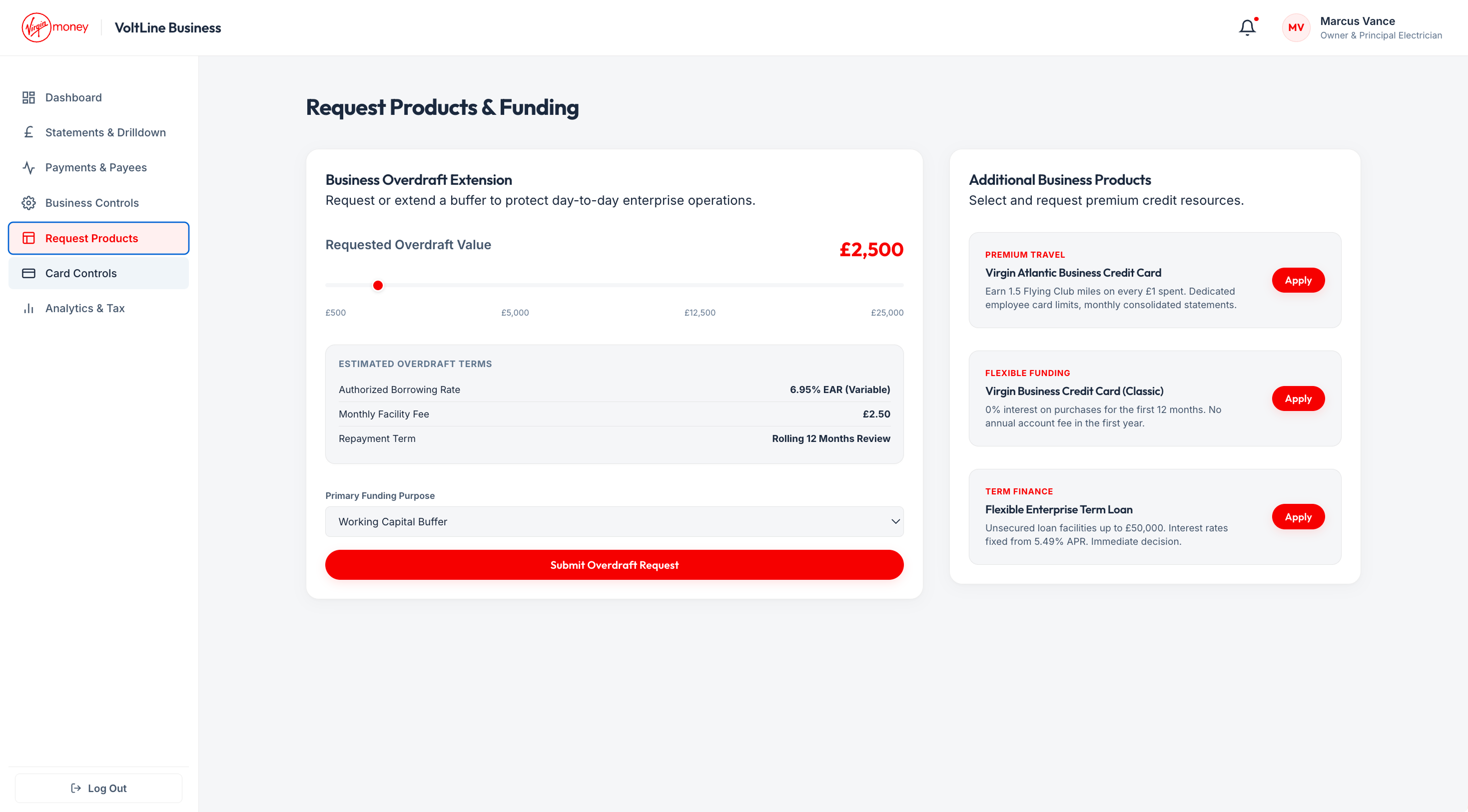
Businesses need more than a current account. The experience makes it easy to explore and apply for additional products like overdrafts and credit lines without leaving the app.
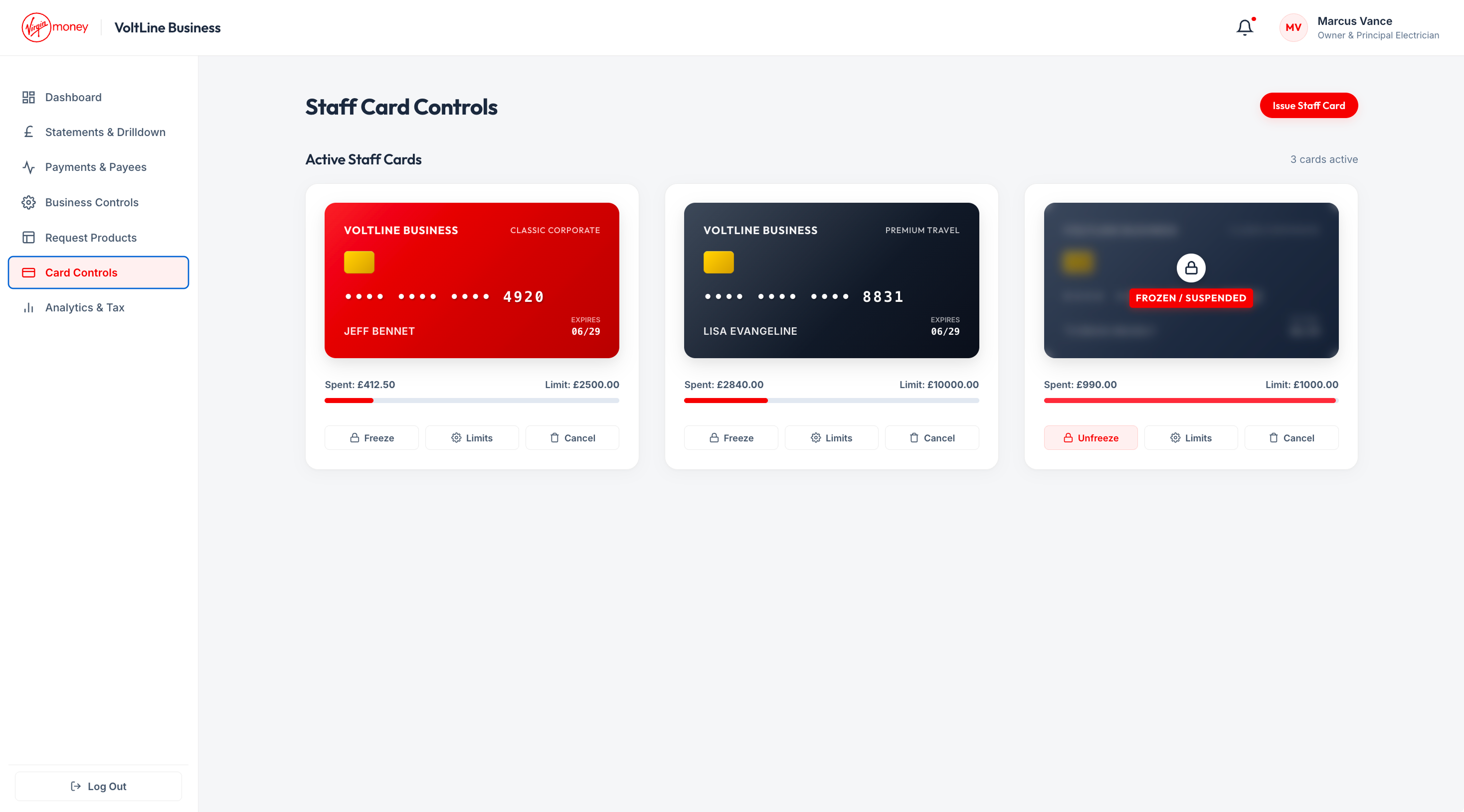
Physical and digital company cards in use, giving staff controlled access to business funds while keeping the owner in charge.
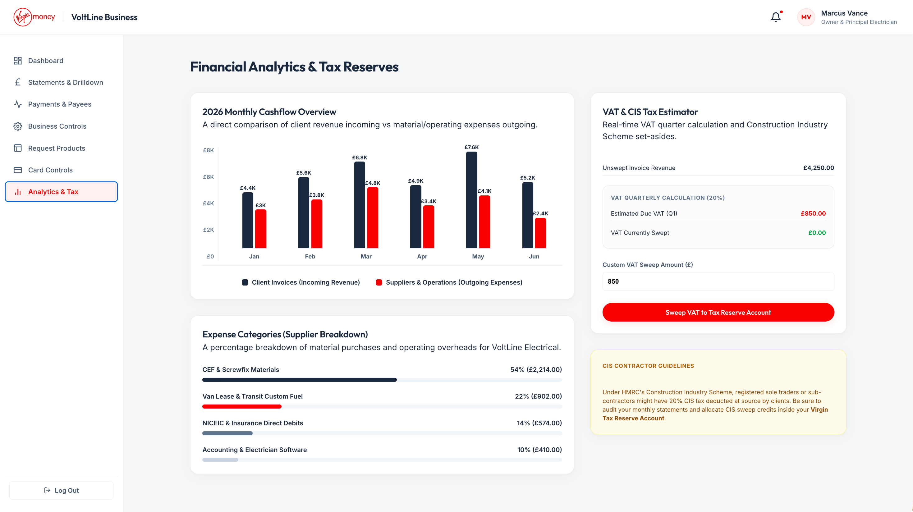
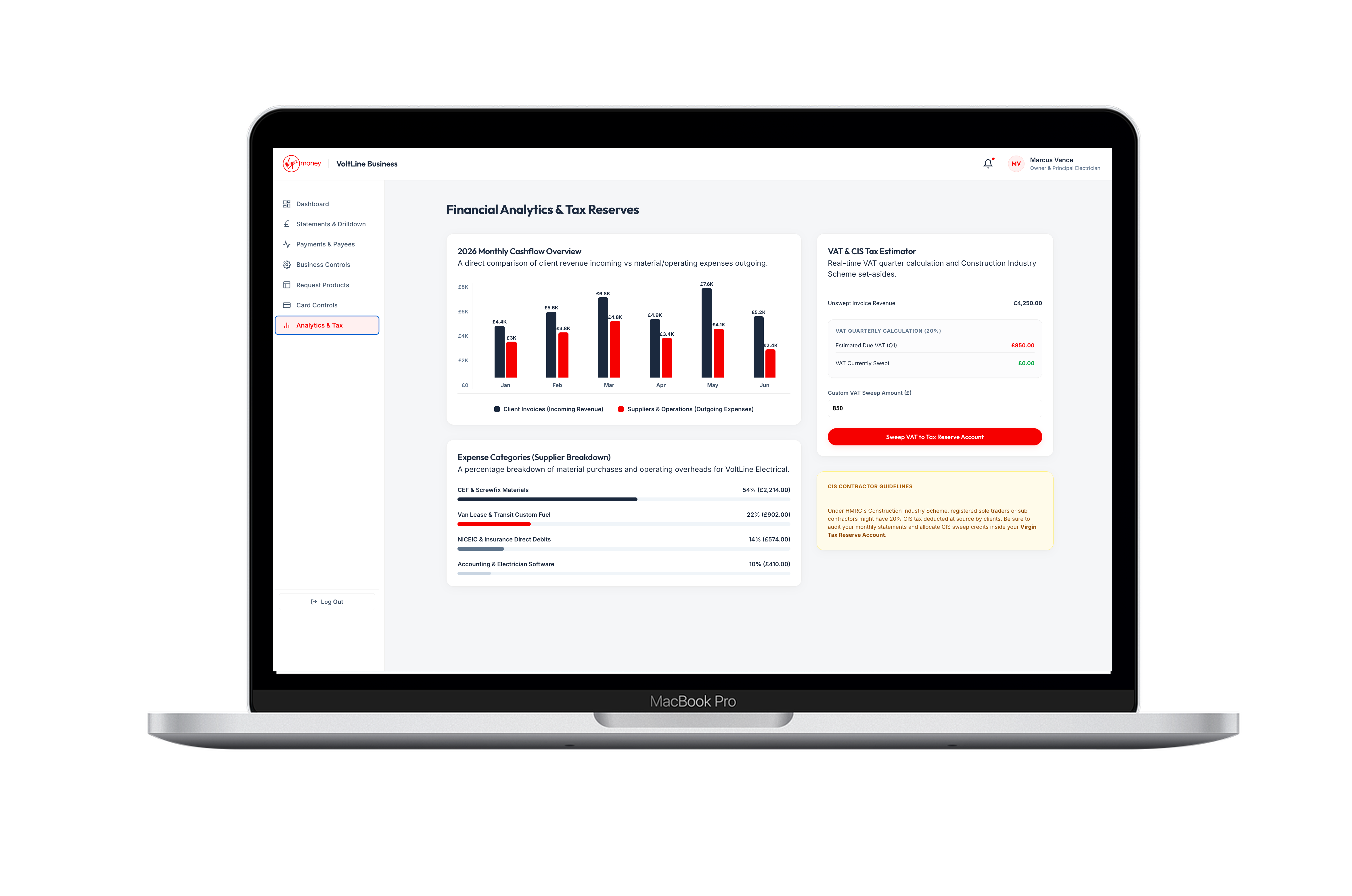
These views were decided by user input into what matters most to small businesses. Track incoming and outgoing cash, monitor VAT payments, and see the biggest expenses without digging through spreadsheets.
Businesses can keep track of changes in their accounts and trace if employees make payments. Alerts give owners visibility without micromanaging every transaction.
Interview preparation built exclusively for the design community
2026 · Founder
Under NDA
Weekend dashboard for Mythos vulnerability intel — then a living executive product shaped by weekly leadership feedback
2026 · AI Product Designer
A card-based online banking experience shaped by discovery, in-branch research, and what customers actually want when they open the app
2023 · Product Design Consultant
Online account opening, business banking, and a £35M Capability & Innovation Fund win
2018 · Product Design Consultant
Building a design function and shipping enterprise products in one year
2020 · Design Manager
European city breaks app for curated destinations and frequent travellers
2022 · Product Designer
Brand, website, and secure booking platform for occupational health
2025 · Product Designer